
Tug of War
Tug of War shows a live two-option voting bar in OBS and other tools that support browser sources. Viewers vote by sending activity with a message, such as donations or cheers.
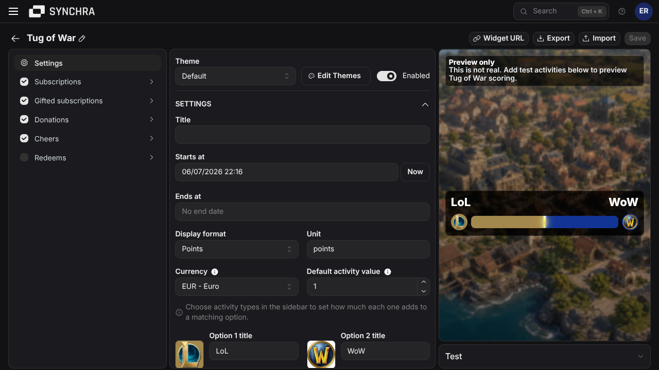
Quick setup
Section titled “Quick setup”- Open the Synchra Dashboard.
- Go to Widgets.
- Create a Tug of War widget.
- Set the option titles, extra keywords, colors and optional images.
- Pick Points or Currency display.
- Set a start date and optional end date.
- Select which message-capable sources should count.
- Click Widget URL and add it to OBS as a Browser Source.
Matching and scoring
Section titled “Matching and scoring”Matching is case-insensitive. Symbols are removed and whitespace is collapsed before matching. Empty titles and keywords never match.
Activity types start from the default activity value and can be fine-tuned in the source settings.
Customization
Section titled “Customization”You can customize the title, options, starting values, default activity value, display mode, dates, lead amount, countdown, sources, multipliers, colors, font, size, padding, border and visibility settings.
Custom CSS
Section titled “Custom CSS”Use custom CSS when the built-in settings are not enough.
CSS order: built-in CSS, Theme CSS, then Widget CSS. Later rules win at equal specificity.
HTML structure
Section titled “HTML structure”Simplified generated markup; optional elements are marked.
Layout: vertical root; two-column option grid; horizontal icon | live bar | icon row with an overlaid lead badge.
CSS classes
Section titled “CSS classes”| Class | Description |
|---|---|
.versus-widget | Root container. It owns the widget theme variables. |
.versus-widget--disabled | Added when disabled. The built-in CSS hides the widget. |
.versus-widget__title | Optional centered widget title. |
.versus-widget__options | Optional two-column wrapper for the option text. |
.versus-widget__option | One option text group. Its data-option identifies the first or second column. |
.versus-widget__option-title | Option title. Long words wrap. |
.versus-widget__value | Optional option score or amount. Uses tabular numerals. |
.versus-widget__bar-row | Flex row containing both icons and the bar. |
.versus-widget__bar-icon | Circular option icon container. Its border and background use the option color. |
.versus-widget__bar-icon-image | Optional image inside an icon container. Uses object-fit: cover. |
.versus-widget__bar-shell | Positioned wrapper for the bar and optional lead badge. |
.versus-widget__bar | Clipped two-part result bar. |
.versus-widget__bar-1 | Option 1 fill. |
.versus-widget__bar-2 | Option 2 fill. |
.versus-widget__divider | Animated divider at the current result split. |
.versus-widget__lead-amount | Optional badge centered over the bar. Its data-option identifies the leading side. |
.versus-widget__meta | Optional metadata row below the bar. |
.versus-widget__countdown | Countdown or ended text. |
Data attributes
Section titled “Data attributes”| Attribute | Element | Description |
|---|---|---|
data-display-mode="points" | .versus-widget | Values are formatted as points. |
data-display-mode="currency" | .versus-widget | Values are formatted as currency. |
data-ended="false" | .versus-widget | Voting has not ended. |
data-ended="true" | .versus-widget | Voting has ended. |
data-leader="" | .versus-widget | The vote is tied or has no leader. |
data-leader="<option-id>" | .versus-widget | Contains the user-defined ID of the leading option. Do not assume a fixed ID. |
data-option="1" | .versus-widget__option, .versus-widget__lead-amount | First option, or a lead badge for the first option. |
data-option="2" | .versus-widget__option, .versus-widget__lead-amount | Second option, or a lead badge for the second option. |
CSS variables
Section titled “CSS variables”| Variable | Value type | Controls |
|---|---|---|
--versus-widget-title-color | CSS color | Widget title color. |
--versus-widget-text-color | CSS color | Option title color. |
--versus-widget-value-color | CSS color | Option values and lead badge text. |
--versus-widget-secondary-text-color | CSS color | Countdown or ended text. |
--versus-widget-background-color | CSS color | Root and lead badge background source. |
--versus-widget-border-color | CSS color | Root border color. |
--versus-widget-bar-1-color | CSS color, runtime-owned | First option’s configured color. Also useful as a token in custom rules. |
--versus-widget-bar-2-color | CSS color, runtime-owned | Second option’s configured color. Also useful as a token in custom rules. |
--versus-widget-bar-1-percent | Percentage, runtime-owned | Live width of option 1 and position of the divider. Option 2 uses the remainder. |
--versus-widget-border-width | CSS length | Root border width. |
--versus-widget-border-radius | CSS length | Root, bar and badge corner treatment. |
--versus-widget-bar-height | CSS length | Result bar height. |
--versus-widget-image-size | CSS length, runtime-owned | Width and height of both option icons. |
--versus-widget-padding | CSS length | Space inside the root. |
--versus-widget-font-family | Font family list | Font for the entire widget. |
--versus-widget-font-size | CSS length | Base text size. |
--versus-widget-min-width | CSS length or percentage | Minimum root width. |
--versus-widget-max-width | CSS length or percentage | Maximum root width. |
Option colors, image size and bar percentage are inline runtime values. Reuse them, but do not override them.
Custom font
Section titled “Custom font”Get a font import, then: