
Leaderboard
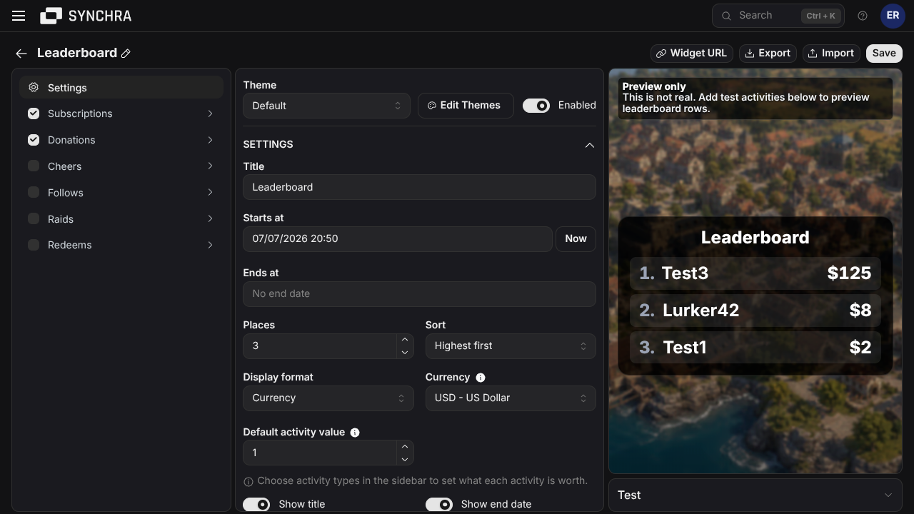
Leaderboard ranks viewers by the activity types you choose. Use it for gifted subs, total subs, tips, bits, follows or a mixed leaderboard where several activity types should count together.
You define how much each activity type is worth. Other currencies will be converted into your preferred one using today’s rates. Activity types start from the default activity value and can be fine-tuned in the source settings.
Quick setup
Section titled “Quick setup”- Open the Synchra Dashboard.
- Go to Widgets.
- Create a Leaderboard widget.
- Enter a title, start date and optional end date.
- Pick how many places to show.
- Pick Points or Currency display.
- Select which sources should count toward the leaderboard.
- Click Widget URL and copy the URL.
- Add it to OBS as a Browser Source.
Customization
Section titled “Customization”You can customize the title, number of places, sort direction, default activity value, display mode, unit, currency, dates, sources, multipliers, colors, font, size, padding, row gap, border and visibility settings.
Custom CSS
Section titled “Custom CSS”Leaderboard can be styled using custom CSS. Start with the built-in settings first. Use custom CSS when you need a specific layout, shadow, background or animation detail.
CSS order: built-in CSS, Theme CSS, then Widget CSS. Later rules win at equal specificity.
HTML structure
Section titled “HTML structure”Simplified generated markup; optional elements are marked.
Layout: vertical row list; each row uses rank | flexible name | value. Long names are truncated.
CSS classes
Section titled “CSS classes”| Class | Description |
|---|---|
.leaderboard-widget | Root container. It owns the widget theme variables. |
.leaderboard-widget--disabled | Added when disabled. The built-in CSS lowers its opacity in previews. |
.leaderboard-widget__title | Optional centered leaderboard title. |
.leaderboard-widget__rows | Vertical row list. --leaderboard-widget-row-gap controls its gap. |
.leaderboard-widget__row | Repeated flex row containing rank, name and value. |
.leaderboard-widget__rank | Optional rank wrapper. Uses tabular numerals. |
.leaderboard-widget__rank-number | Numeric portion of the rank. |
.leaderboard-widget__rank-suffix | Visual punctuation after the rank, such as .. |
.leaderboard-widget__name | Viewer display name. The built-in style truncates it with an ellipsis. |
.leaderboard-widget__value | Optional score or currency amount. Uses tabular numerals. |
.leaderboard-widget__deadline | Optional time-left text below all rows. |
Data attributes
Section titled “Data attributes”| Attribute | Element | Description |
|---|---|---|
data-display-mode="points" | .leaderboard-widget | Values are formatted as points. |
data-display-mode="currency" | .leaderboard-widget | Values are formatted as currency. |
data-target="leaderboard-row" | .leaderboard-widget__row | Stable marker applied to every row. |
data-position="1" | .leaderboard-widget__row | Numeric row position. Use any positive number in selectors, not only 1. |
CSS variables
Section titled “CSS variables”| Variable | Value type | Controls |
|---|---|---|
--leaderboard-widget-title-color | CSS color | Title color. |
--leaderboard-widget-text-color | CSS color | Default row text color. |
--leaderboard-widget-secondary-text-color | CSS color | Rank and deadline color. |
--leaderboard-widget-value-color | CSS color | Score or amount color. |
--leaderboard-widget-background-color | CSS color | Root background. Alpha colors keep the OBS canvas visible. |
--leaderboard-widget-row-background-color | CSS color | Background of every row. |
--leaderboard-widget-border-color | CSS color | Root border color. |
--leaderboard-widget-border-width | CSS length | Root border width. |
--leaderboard-widget-border-radius | CSS length | Root radius; rows derive a smaller radius from it. |
--leaderboard-widget-row-gap | CSS length | Vertical space between rows. |
--leaderboard-widget-padding | CSS length | Space inside the root. |
--leaderboard-widget-font-family | Font family list | Font for the entire widget. |
--leaderboard-widget-font-size | CSS length | Base text size. |
--leaderboard-widget-min-width | CSS length or percentage | Minimum root width. |
--leaderboard-widget-max-width | CSS length or percentage | Maximum root width. |
Set theme variables on .leaderboard-widget.
Custom font
Section titled “Custom font”Get a font import, then: