
Activity Alerts Widget
Activity Alerts show live stream alerts in OBS and other tools that support browser sources. It displays subs, gifts, raids, donations, rewards and other activity alerts from your connected platforms.
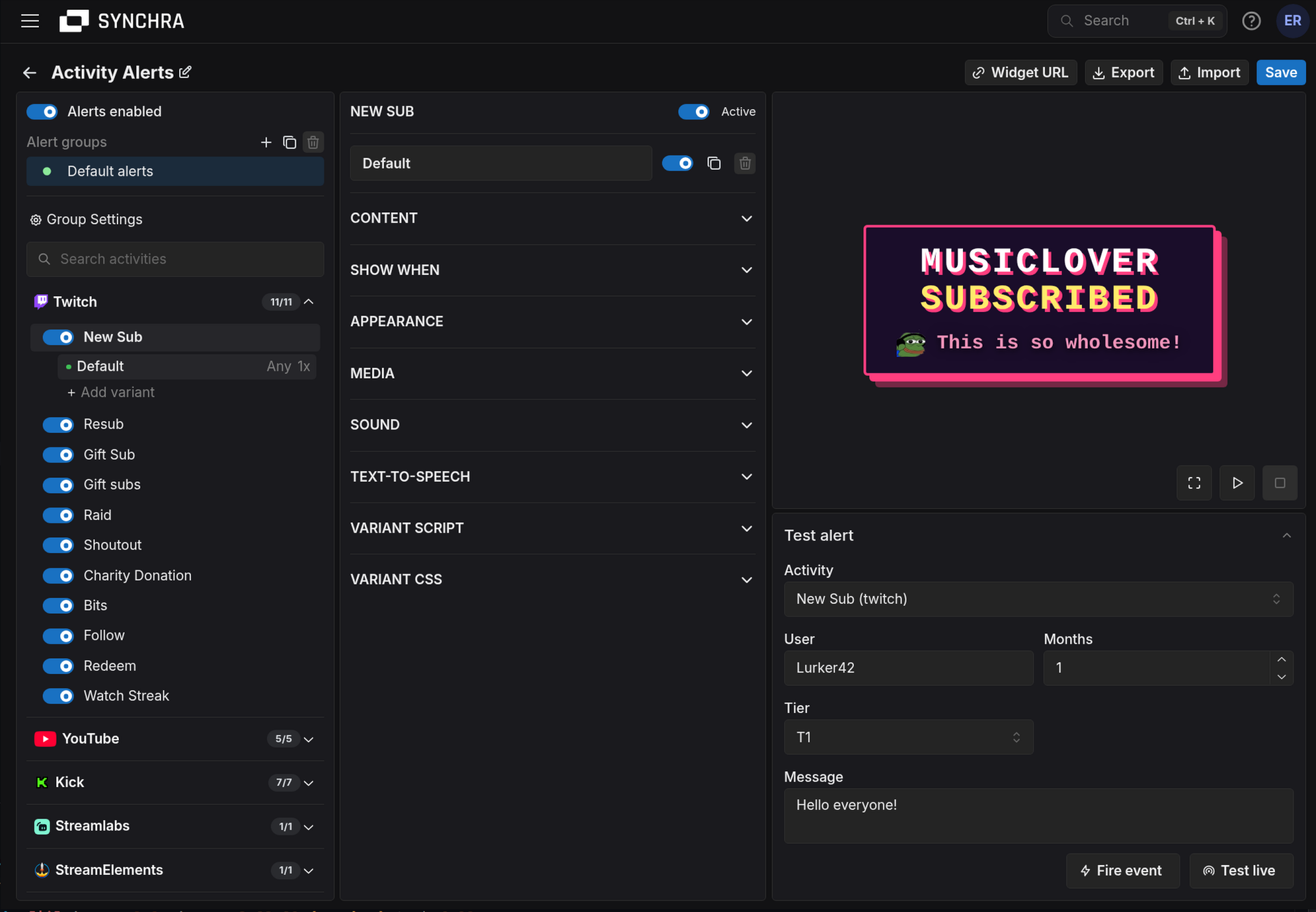
Quick setup
Section titled “Quick setup”- Open the Synchra Dashboard.
- Go to Widgets.
- Create an Activity Alerts widget.
- Click Widget URL and copy the URL.
- Add it to OBS as a Browser Source.
- Set the source size to match your stream, for example
1920x1080,800x600or whatever fits your stream layout.
Recommended setup
Section titled “Recommended setup”Start by disabling the activity types you don’t want an alert for. Pick a theme, adjust colors, then set up media, sound and text-to-speech voices.
Create variants when an alert needs special behavior, such as large donations, long resubs.
Media, sound, TTS and variant packs
Section titled “Media, sound, TTS and variant packs”Media, sound, TTS and variant packs make shared alert assets easy to manage across platforms.
Default pack slots are included for follows, subscriptions, gifted subscriptions, donations, gifts, raids and redeems. Customize a default pack once, and every variant using that pack gets the update. Variants can still add their own single media items, sounds or TTS voices on top. Variant packs can refine a variant after it matches, for example to share special tier, amount or keyword versions across multiple rules.
What you can customize
Section titled “What you can customize”- Alert text for each activity type.
- Colors, font size, max width, duration and animations.
- Media placement above, below, beside, behind or in front of text.
- Independent title and message positioning, display delays and entrance animations.
- Reusable themes for a consistent look.
- Reusable media, sound, text-to-speech and variant packs.
- Image or video media.
- Separate alert sounds, media sounds, or imports from Sound Alerts.
- Text-to-speech from connected TTS providers.
- Custom TypeScript scripts for advanced behavior.
- Variants for different amounts, counts or sub types.
- Chance controls for variants, media, sounds and TTS voices.
- Queue delay between alerts.
- Pause, mute, skip, play next and replay controls.
- Export and import widget settings as JSON.
How alerts are organized
Section titled “How alerts are organized”| Part | What it does |
|---|---|
| Group | A full alert setup. Only the active group plays. Use groups for normal, event or seasonal alert packs. |
| Rule | Matches one alert type, such as Twitch raid or Streamlabs donation. |
| Variant | A version of a rule with its own content, conditions, design, media, audio and advanced settings. |
| Theme | Reusable appearance, layout, timing and CSS settings. |
| Media, sound or text-to-speech pack | Reusable assets shared by variants across providers. |
| Variant pack | Reusable refinements applied after a rule variant matches. |
When activity comes in, Synchra checks the active group, finds the matching rule, then picks the best matching variant. If that variant has active variant packs, Synchra then picks the best matching pack variant and merges it over the fallback settings from the matched rule variant. See Matching and Chance for how variants and pack items are selected.
Variants and filters
Section titled “Variants and filters”Variants let one alert type have multiple versions.
Useful examples:
- Small donation: simple alert.
- Large donation: bigger animation and TTS.
- Resub from
1to5months: normal alert. - Resub from
12months and up: special alert. - Twitch sub tier
3000: premium alert.
Filters can use value ranges and sub types when the provider sends that data. For example, Twitch subs can filter by Prime, T1, T2 or T3. Filters can also use message keywords for activity types that include a viewer message.
Text templates
Section titled “Text templates”The title and message fields support variables.
| Variable | Meaning |
|---|---|
{user} or {viewer} | Viewer display name. |
{viewer_name} | Viewer username. |
{recipient} | Gift recipient display name, when available. |
{recipient_name} | Gift recipient username, when available. |
{amount} | Formatted money amount, when available. |
{value} | Number of months, subs, bits, viewers, etc. |
{unit} | Months, subs, bits, etc. |
{type} | Activity type display name. |
{subtype} | Sub type display name, such as a sub tier, redeem name, . |
{provider} | Activity provider, such as twitch or youtube. |
{message} | Viewer message, when available. |
{system_message} | Provider/system message, when available. |
Examples:
Layout and motion
Section titled “Layout and motion”Use Media placement to put selected image or video media above, below, to either side of, behind, or in front of the alert text.
In the variant or group Design tab, drag the title or message directly in the preview to position it. The corresponding X position and Y position fields update when you release it. Use those fields when you need an exact value or cannot use dragging:
- Positive X moves right; negative X moves left.
- Positive Y moves down; negative Y moves up.
- Set both values to
0to use the normal position.
Title and message positions are independent. Each also has its own Entrance animation and Show delay. The selected animation starts after that text element’s delay, so the title and message can enter at different times with different effects.
The available entrance animations are None, Fade, Slide up, Slide down, Slide left, Slide right, Pop, Bounce, Flip, Zoom, Spin, Drop, Swing, Blur and Glitch. None leaves text unanimated when its delay is 0. With a nonzero delay it uses a short reveal after the delay, preserving the existing delayed-text behavior.
Text delays and entrance animations run only during alert playback. The design preview keeps the text visible so it can still be styled and positioned.
Use the independent Text alignment controls to align the title or message left, center or right within the available text area. Alignment changes how text sits inside its layout area; X and Y position move that area.
Layout and motion settings can be defined on themes, groups, rule variants and variant-pack variants. More specific values override inherited values.
Media, sound and text-to-speech
Section titled “Media, sound and text-to-speech”Media can be an image or video URL. Sounds can be separate sound URLs, or attached directly to a media item with Sound URL.
For reusable assets, put media in media packs and sounds in sound packs. If the selected media item has Sound URL, that sound plays instead of the selected separate sound. If the selected media is a video and no separate sound is selected, the video can use its embedded audio; otherwise the video is muted so audio sources do not overlap.
Text-to-speech uses connected providers, such as TTSMonster, ElevenLabs or Amazon Polly. Create one or more voices, choose what they read, then reuse them through text-to-speech packs.
Viewer voice requests
Section titled “Viewer voice requests”Enter just the name in Voice trigger below the provider’s voice ID, for example peter.
The widget handles the message prefix automatically. Viewers can start their message with peter: hello to select that voice.
Matching ignores capitalization, and the prefix is removed from the spoken message.
The displayed alert message stays unchanged.
Leave Voice trigger empty on at least one voice for automatic selection when there is no matching voice request. Viewer-request voices only play when requested and when their conditions match. If the requested voice is disabled, unavailable, or does not meet its conditions, an eligible automatic voice is used instead and the message is read unchanged. Without an eligible automatic voice, no TTS plays for that message. Message keyword filters are not voice selectors; configure viewer requests through Voice trigger.
Alert sound plays first. Text-to-speech starts after the sound finishes. If you set a speech start delay, that delay is added after the sound finishes.
Custom CSS
Section titled “Custom CSS”Start with the built-in settings first. Use custom CSS when you want a specific layout, border, font, glow, background or animation detail. Choose Apply to update the preview.
CSS order: built-in CSS, Theme CSS, Group CSS, then Variant CSS. Later rules win at equal specificity.
HTML structure
Section titled “HTML structure”Simplified generated markup; optional elements are marked.
Layout: full-size centered root; media placement changes the inner layout between column, row and layered grid. Alert entry and exit classes animate .activity-alert. Independent title and message entry classes animate their .activity-alert__content elements, leaving positioning transforms on .activity-alert__title and .activity-alert__message.
CSS classes
Section titled “CSS classes”| Class | Description |
|---|---|
.activity-alert-widget | Full-canvas root. It centers the alert and contains the celebration as a sibling overlay. |
.activity-alert | Main alert container. It owns the resolved variables and animation/state classes. |
.activity-alert__layout | Inner layout containing optional media and text. Media-placement classes change its direction or grid layering. |
.activity-alert__media | Shared class on an optional <img> or <video>. Built-in sizing uses object-fit: contain. |
.activity-alert__media--image | Added when the media element is an image. |
.activity-alert__media--video | Added when the media element is a video. |
.activity-alert__text | Optional column containing the title and message. |
.activity-alert__title | Optional title positioning wrapper. |
.activity-alert__message | Optional message positioning wrapper. |
.activity-alert__content | Inner title or message content layer. Long content wraps here. |
.activity-alert__content--title | Identifies the title content and animation layer and applies the title delay variable. |
.activity-alert__content--message | Identifies the message content and animation layer and applies the message delay variable. |
.activity-alert__content--reveal | Used for the basic delayed reveal when the text entrance animation is None. |
.activity-alert--<animation> | Applies a built-in animation. Values are none, fade, slide_up, slide_down, slide_left, slide_right, pop, bounce, flip, zoom, spin, drop, swing, blur and glitch. The class can appear on the main alert or a text content layer. |
.activity-alert__var | Inline <span> around any rendered template variable. |
.activity-alert__var--user | {user} variable. |
.activity-alert__var--viewer | {viewer} variable. |
.activity-alert__var--recipient | {recipient} variable. |
.activity-alert__var--amount | {amount} variable. |
.activity-alert__var--value | {value} variable. |
.activity-alert__var--count | {count} variable. |
.activity-alert__var--unit | {unit} variable. |
.activity-alert__var--count_name | {count_name} variable. |
.activity-alert__var--subtype | {subtype} variable. |
.activity-alert-celebration | Full-canvas celebration layer. It is always present but can be empty. |
.activity-alert-celebration__particle | Repeated particles inserted during a celebration. Particle elements receive inline position and animation styles. |
The main alert also gets a media-placement class: .activity-alert--media-above, .activity-alert--media-below, .activity-alert--media-left, .activity-alert--media-right, .activity-alert--media-behind, or .activity-alert--media-front.
Every rendered template variable gets a matching modifier class based on the variable name.
For example, {viewer_name} gets .activity-alert__var--viewer_name.
Data attributes
Section titled “Data attributes”| Attribute | Element | Use |
|---|---|---|
data-group="<group-name>" | .activity-alert | Target the active group by its user-defined name. |
data-rule="raid" | .activity-alert | Target an activity type, such as raid, sub or donation. |
data-variant="<variant-name>" | .activity-alert | Target the selected variant by its user-defined name. |
data-part="title" | .activity-alert__content | Identifies the inner title content element exposed to custom scripts. |
data-part="message" | .activity-alert__content | Identifies the inner message content element exposed to custom scripts. |
data-activity-alert-script-media="<type>" | Script-created media | Identifies an image, video or audio element created through the custom-script API. |
data-celebration-type="confetti" | .activity-alert-celebration | Target a celebration such as confetti, snow, lunarNewYear or cherryBlossom. It is empty when no celebration runs. |
Group and variant values are names entered by the user. Match the exact value in a quoted attribute selector.
CSS variables
Section titled “CSS variables”| Variable | Value type | Controls |
|---|---|---|
--activity-alert-font-family | Font family list | Font for the entire alert. |
--activity-alert-text-color | CSS color | Default alert text. |
--activity-alert-user-color | CSS color | User, viewer and recipient template variables. |
--activity-alert-viewer-color | CSS color | Compatibility fallback for viewer-related variables. It normally matches the user color. |
--activity-alert-count-color | CSS color | Amount, count and value template variables. |
--activity-alert-count-name-color | CSS color | Unit, count-name and subtype template variables. |
--activity-alert-max-width | CSS length | Maximum width of the main alert. Defaults to the available width when unset. |
--activity-alert-font-size | CSS length | Title font size. |
--activity-alert-message-font-size | CSS length | Message font size. |
--activity-alert-title-offset-x | CSS length | Horizontal title translation. |
--activity-alert-title-offset-y | CSS length | Vertical title translation. |
--activity-alert-title-alignment | left, center or right | Title text alignment. |
--activity-alert-title-delay | CSS time | Delay before the title entrance animation or basic reveal starts. |
--activity-alert-message-offset-x | CSS length | Horizontal message translation. |
--activity-alert-message-offset-y | CSS length | Vertical message translation. |
--activity-alert-message-alignment | left, center or right | Message text alignment. |
--activity-alert-message-delay | CSS time | Delay before the message entrance animation or basic reveal starts. |
These variables are inline on .activity-alert. Reuse them as tokens; override element properties instead of redeclaring the variables.
Custom font
Section titled “Custom font”Get a font import, then:
Branded card
Section titled “Branded card”Highlight names and amounts
Section titled “Highlight names and amounts”Style only raids
Section titled “Style only raids”Larger media
Section titled “Larger media”Celebration particles
Section titled “Celebration particles”Custom scripts
Section titled “Custom scripts”Custom scripts add behavior to the normal alert. They do not replace the built-in renderer, so the title template, message template, media, sounds, CSS and animations still work unless your script changes the DOM itself. Choose Apply to update the preview, then Save to keep the change.
Scripts can be added in three places: Theme, Group and Variant.
When more than one script applies, Synchra loads them in this order: Theme script > Group script > Variant script. The selected variant theme is used when the variant has its own theme; otherwise the group theme is used.
Each script uses synchra.defineAlertScript.
onShow runs once after the alert DOM is rendered.
Script lifecycle
Section titled “Script lifecycle”| Hook | When it runs |
|---|---|
onShow(ctx) | Once when an alert playback is rendered. Can return a cleanup function. |
onExit(ctx) | When the alert starts exiting. |
onPreview(ctx) | Instead of onShow for a static editor preview without playback. |
onCleanup(ctx) | When the alert is removed. Cleanup functions returned from onShow also run. |
Script context
Section titled “Script context”The ctx object gives the script access to the current alert:
See Activity data for the fields on ctx.activity and how activity and contribution groups avoid provider-specific type checks.
| Property | Meaning |
|---|---|
ctx.activity | The activity event. |
ctx.vars | The same formatted values used by text templates, such as user, amount, value and message. |
ctx.itemId | The unique ID for this rendered alert item. |
ctx.elements.root | The widget root element. |
ctx.elements.alert | The main .activity-alert element. |
ctx.elements.title | The inner title content element ([data-part="title"]), if rendered. |
ctx.elements.message | The inner message content element ([data-part="message"]), if rendered. |
ctx.elements.media | The configured or script-created image or video element, if one is rendered. |
ctx.elements.audio | The first script-created audio element, if one exists. Built-in sound playback is not exposed as a DOM element. |
ctx.elements.createMedia("image") | Create and mount an HTMLImageElement using the normal alert media layout and styles. |
ctx.elements.createMedia("video") | Create and mount an HTMLVideoElement using the normal alert media layout and styles. |
ctx.elements.createAudio() | Create and mount a hidden HTMLAudioElement. |
ctx.group | The active alert group. |
ctx.rule | The matched alert rule. |
ctx.variant | The selected variant. |
ctx.mediaAsset | The selected image or video asset, if any. |
ctx.soundAsset | The selected sound asset, if any. |
ctx.ttsAsset | The selected TTS asset, if any. |
ctx.settings | The resolved visual, TTS, CSS and script settings for this alert. |
ctx.exiting | true during exit handling. |
ctx.playback | true during normal widget playback. |
Script-created audio and video follow the widget’s mute state. Synchra automatically removes created images and stops and removes created audio or video when the alert is cleaned up.
The resolved text timing settings are available to scripts:
| Property | Meaning |
|---|---|
ctx.settings.title_animation_type | Resolved title entrance animation name. |
ctx.settings.title_delay_seconds | Seconds before the title entrance starts. |
ctx.settings.message_animation_type | Resolved message entrance animation name. |
ctx.settings.message_delay_seconds | Seconds before the message entrance starts. |
The context also exposes a shared registry for scripts on the same alert:
| Method | Use |
|---|---|
ctx.provide(name, value) | Store one helper value. |
ctx.provide({ ... }) | Store multiple helper values. |
ctx.get(name) | Read a helper value, or undefined if it does not exist. |
ctx.require(name) | Read a helper value and throw if it does not exist. |
ctx.has(name) | Check whether a helper value exists. |
ctx.remove(name) | Remove a helper value. |
ctx.helpers<T>() | Read helpers through a typed object. |
Create media from the activity message
Section titled “Create media from the activity message”Show an image from a URL in the alert message:
Play script-provided audio
Section titled “Play script-provided audio”Play audio from a URL:
Fetch data
Section titled “Fetch data”Replace the alert HTML
Section titled “Replace the alert HTML”If you want to take over the markup completely, replace the widget root HTML.
Cleanup timers and listeners
Section titled “Cleanup timers and listeners”Return a cleanup function from onShow when the script starts timers, animations or event listeners.
Share helpers between scripts
Section titled “Share helpers between scripts”Theme, group and variant scripts for the same alert share an in-memory helper registry. This registry only exists while that alert is being shown; it is not a database and it is not persisted.
Use ctx.provide in a theme or group script:
Use the helpers in a variant script: