
Subathon Widget
The Subathon Widget shows a live countdown timer in OBS and other tools that support browser sources. Use it when viewer activity should add time to a stream timer.
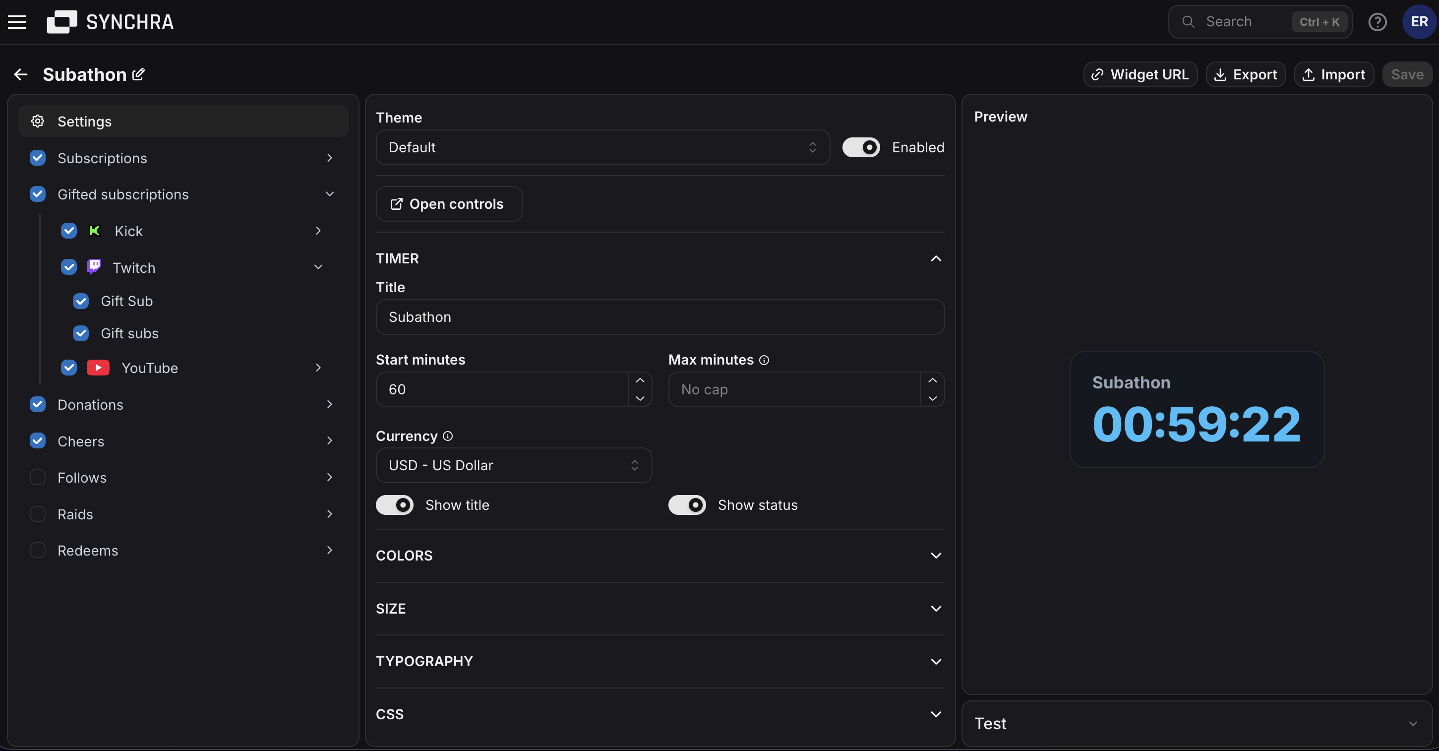
Quick setup
Section titled “Quick setup”- Open the Synchra Dashboard.
- Go to Widgets.
- Create a Subathon widget.
- Enter a title and start minutes.
- Add max minutes if the timer should have a cap.
- Select which sources should add time.
- Set how many seconds each source adds.
- Click Widget URL and copy the URL.
- Add it to OBS as a Browser Source.
- Open Controls and start the timer.
Timer controls
Section titled “Timer controls”Open controls from the widget settings.
You can start, pause, resume, restart, reset, add seconds and remove seconds.
How time is added
Section titled “How time is added”The timer starts with the configured start minutes. When it is running, it counts down until it reaches zero. When it is paused, it stays where it is.
Activity’s such as subbing, bits, donations etc, add seconds after the timer has started defined by you how much time they each add.
Customization
Section titled “Customization”You can customize the title, start minutes, max minutes, sources, seconds, subtype multipliers, colors, font, size, border and visibility settings.
Disabling the widget hides it from the browser source.
Custom CSS
Section titled “Custom CSS”The Subathon Widget can be styled using custom CSS.
CSS Classes
| Class | Description |
|---|---|
.subathon-widget | Main subathon widget container. |
.subathon-widget__title | Widget title. |
.subathon-widget__timer | Countdown timer text. |
.subathon-widget__status | Status text, such as paused or ended. |
Data Attributes
| Attribute | Description |
|---|---|
data-status="idle" | Timer has not started. |
data-status="running" | Timer is running. |
data-status="paused" | Timer is paused. |
data-status="ended" | Timer reached zero. |
CSS Variables
| Variable | Description |
|---|---|
--subathon-widget-text-color | Main text color. |
--subathon-widget-secondary-text-color | Title and status text color. |
--subathon-widget-background-color | Widget background. |
--subathon-widget-border-color | Widget border color. |
--subathon-widget-accent-color | Timer text color. |
--subathon-widget-warning-color | Timer color when ended. |
--subathon-widget-border-width | Widget border width. |
--subathon-widget-border-radius | Widget corner radius. |
--subathon-widget-font-family | Widget font family. |
--subathon-widget-font-size | Base font size. |
--subathon-widget-max-width | Maximum widget width. |